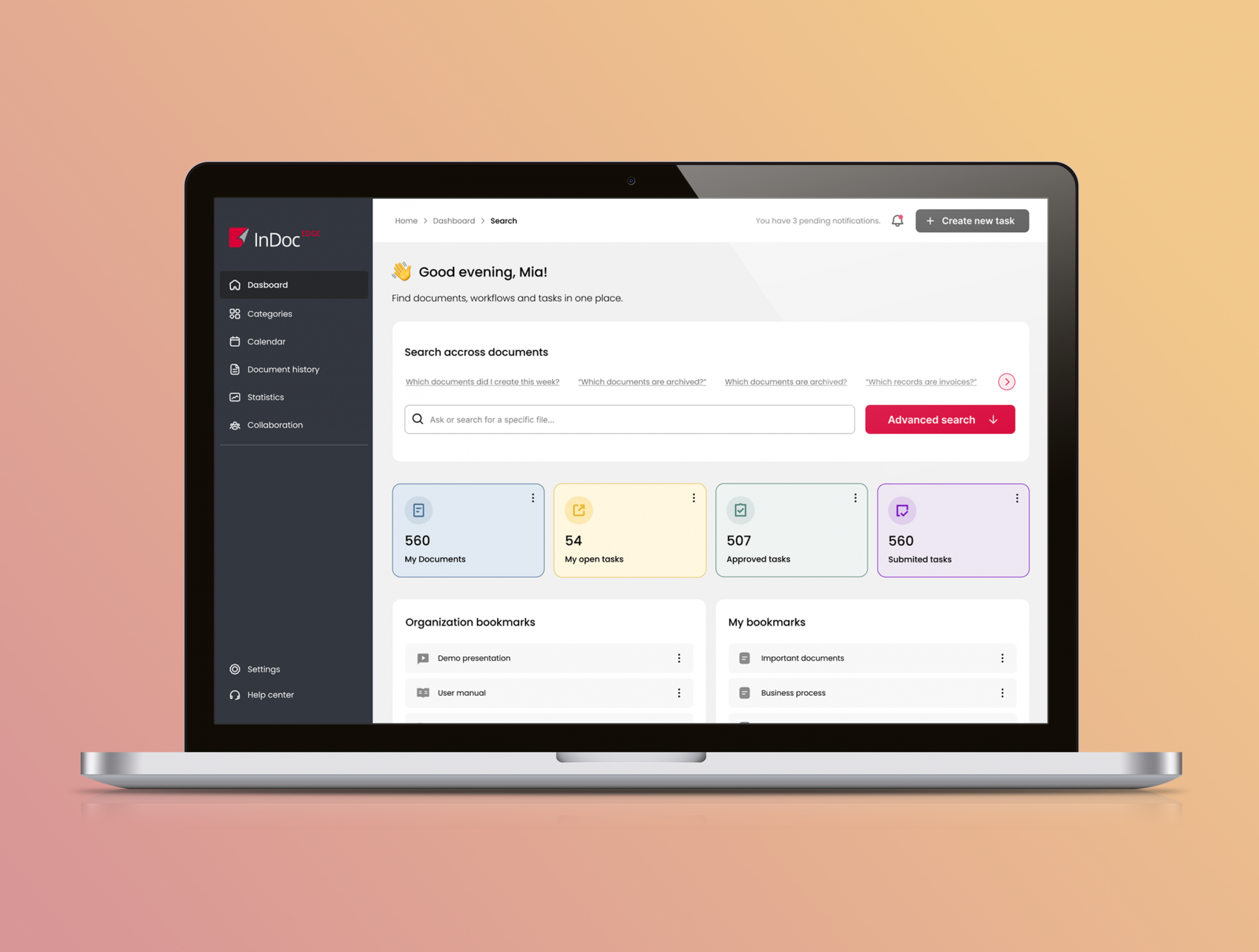
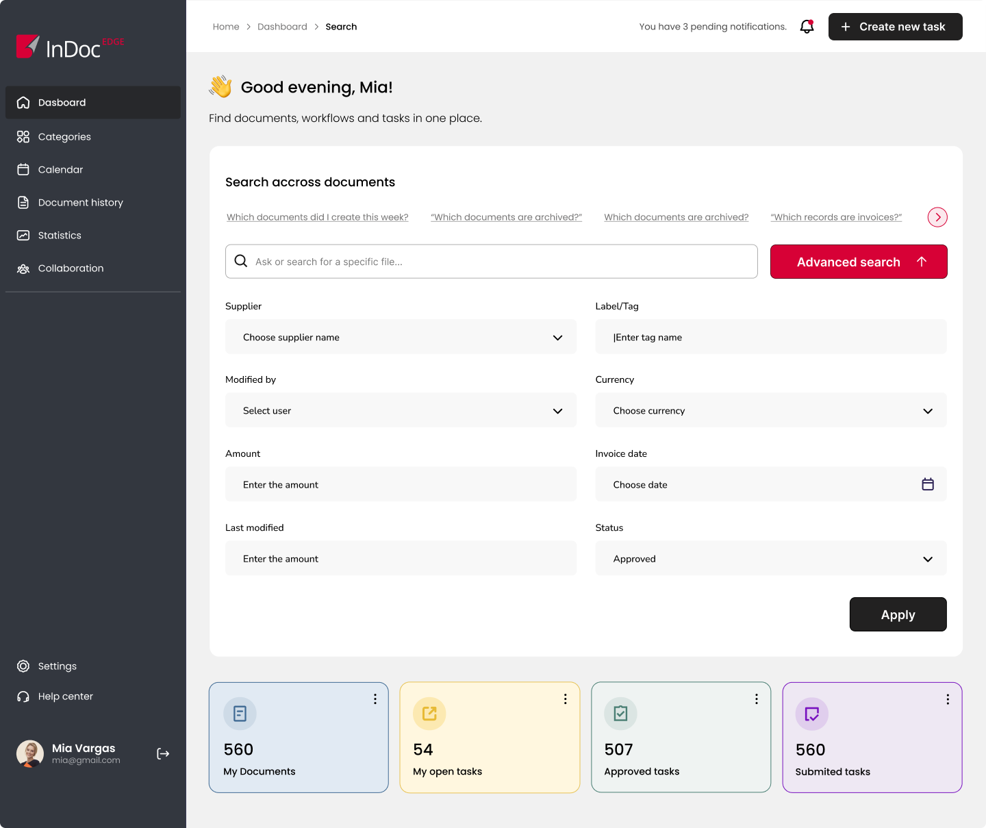
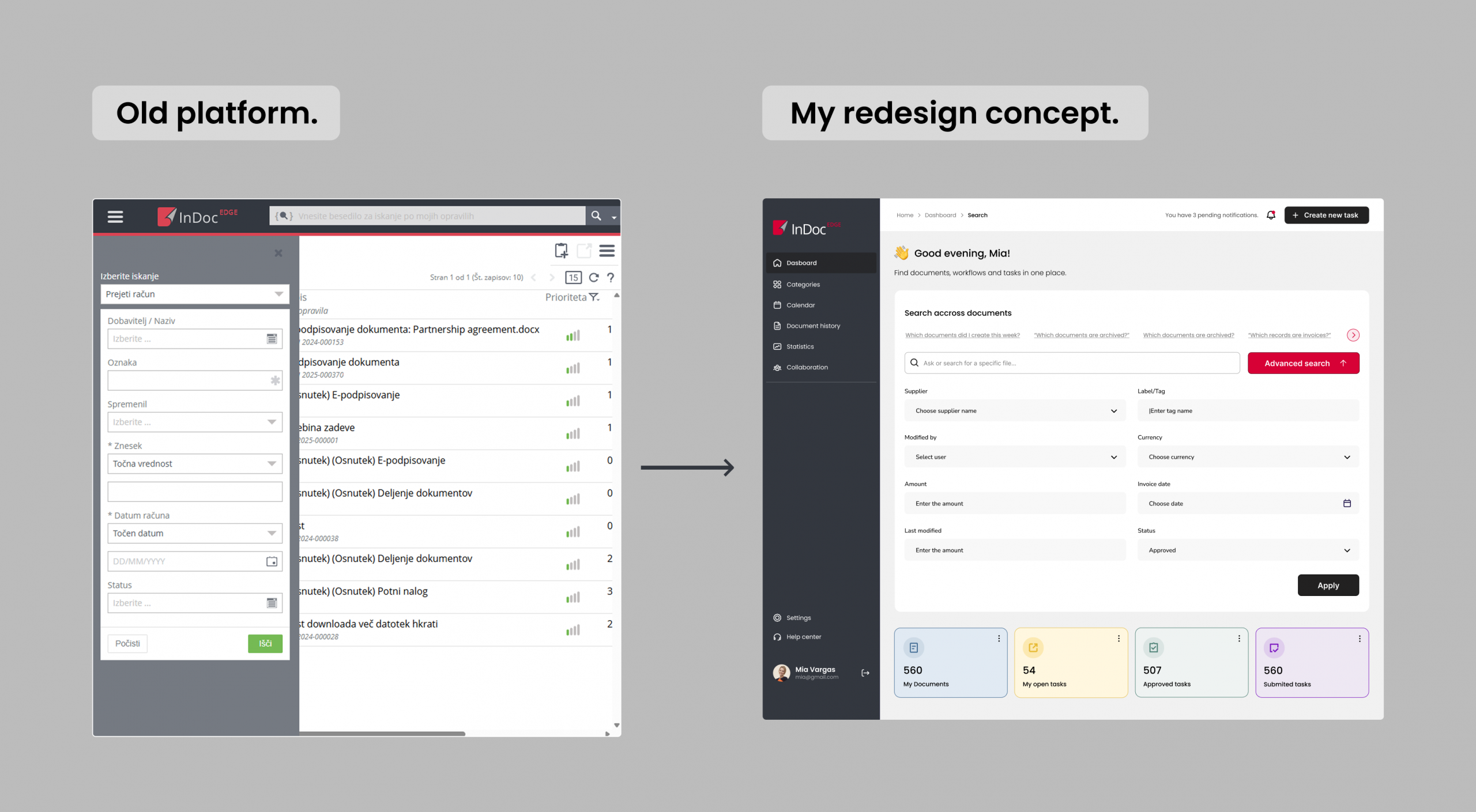
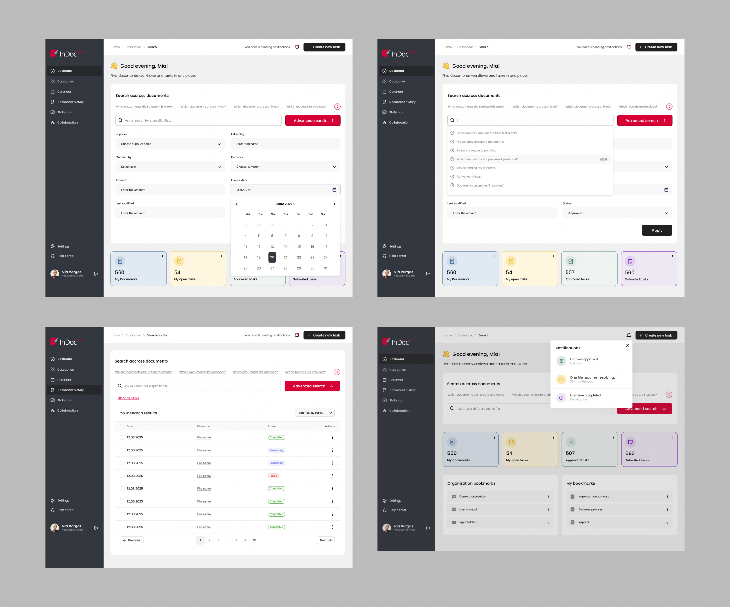
The existing platform had a very outdated interface and a cluttered structure that made navigation and data overview difficult. I created a redesign proposal focused on modernizing the dashboard and improving usability.
The new design introduces clearer information hierarchy, simplified navigation, and a more structured layout for key metrics and actions. By reducing visual noise and reorganizing the interface, the dashboard becomes easier to scan, understand, and use in daily workflows.