
Solace AI
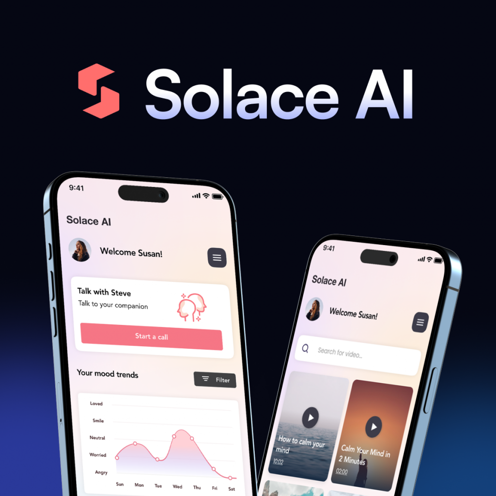
To better understand how users interact with Solace AI, I mapped the overall application flow and the key paths users can take throughout the experience. The goal was to design a simple and supportive structure where users can quickly access tools that help them reflect, relax, and process their emotions. After onboarding and a short personalization process, users enter the main dashboard, which acts as the central hub of the application. From there, they can start a conversation with the AI companion, write a journal entry, explore calming exercises, or access curated content designed to support mental wellbeing. This flow highlights how different features connect within the app and how users can move between reflection, guidance, and relaxation depending on their current emotional needs. To better understand how users interact with Solace AI, I mapped the overall application flow and the key paths users can take throughout the experience. The goal was to design a simple and supportive structure where users can quickly access tools that help them reflect, relax, and process their emotions. “Sometimes I just need a quiet space to clear my head and understand what I’m feeling.” The navigation was designed to be simple and intuitive, allowing users to easily move between the main parts of the application. From the home screen, users can quickly access the video library, the AI companion, and their personal account settings. The AI tool represents the core feature of the product, so it is accessible through multiple paths. Users can start interacting with the AI directly from the home screen or navigate to the dedicated AI tab, providing two clear routes to reach the main functionality of the app. Before moving into visual design, I created a large set of low-fidelity wireframes to map the overall structure of the product. Based on the identified user needs and frustrations, I mapped the main pain points and translated them into practical design solutions. The goal was to ensure that each key challenge users face is directly addressed through a specific feature within the app. By connecting user problems with clear product solutions, the design focuses on providing emotional support, simplifying reflection, and offering accessible tools such as AI conversations, guided journaling, relaxation exercises, and mood insights. Important info: Designing Solace AI was an engaging exploration of how AI-driven tools can support people in everyday moments of stress, reflection, and emotional awareness. The project highlights how thoughtfully designed digital experiences can provide accessible mental wellness support through conversation, journaling, and calming exercises. At the same time, it is important to recognize that tools like this should be approached responsibly. AI can offer helpful guidance and space for reflection, but it is not intended to replace professional medical or psychological care. Instead, it can act as a complementary support tool that helps users better understand their thoughts and emotions. Thank you for watching.
Car booking
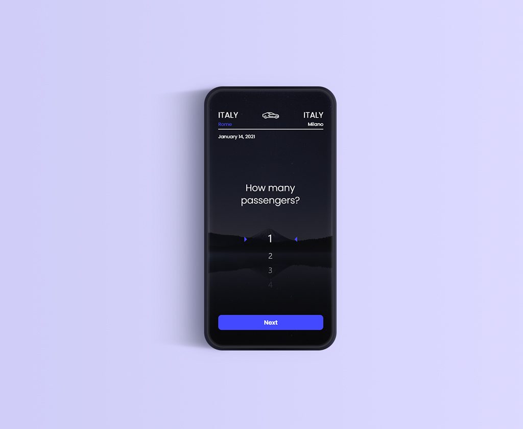
This was a concept for an app that will be similar to the Bla-bla car application. So basically you need a cheap and affordable ride and after all traveling by car is faster than taking regular bus rides. Mostly idea is to travel around the country, from town to town. But there is also an option to travel outside the country if someone is going in the same direction as you. There is also an option to see experiences from previous rides, other passengers rated the driver so you know what you can expect. You can also see prices from cheaper to the drives that costs more money but at the same time that guarantee more comfort while driving. Raised money price indicates that the vehicle is new and luxurious. The colors that I used in this particular project, are a bit darker but there was also an option for light mode.
Cooking app
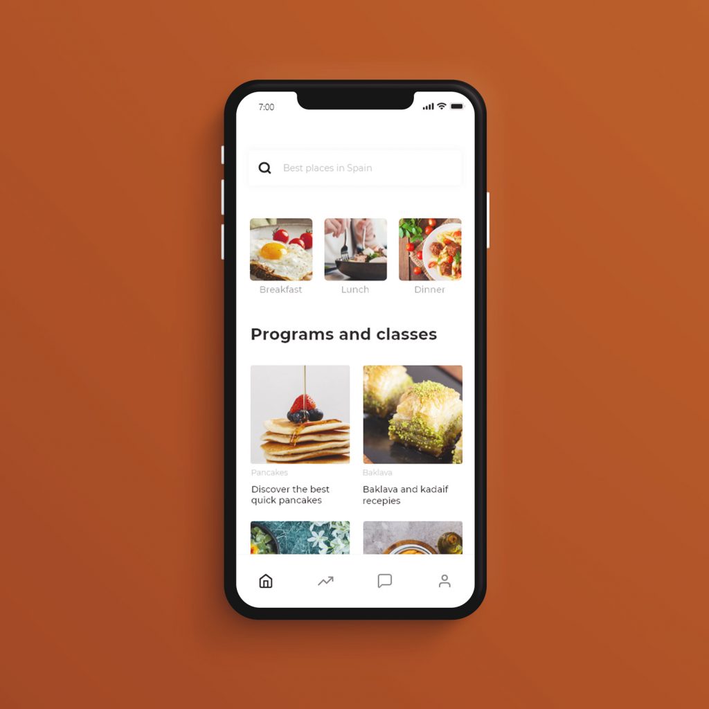
The original idea of this app was to create an easy environment for booking interesting culinary classes. The main reason why this app is worth seeing is that you can learn everything about native cuisine from the right people. For example you can learn how to prepare sushi from people who traditionally were creating it for years now. In this way, you can interact with people from all over the world and learn from their best practice. Classes are easy to understand and every event can be organized online. But some classes can be hosted inside restaurants, so people located nearby can choose to go directly or to follow virtually. There is also space for chatting and messaging with other class attendants and with class organizer. Goal was to have a playful look, but also a clean and modern style.
Tv Guide
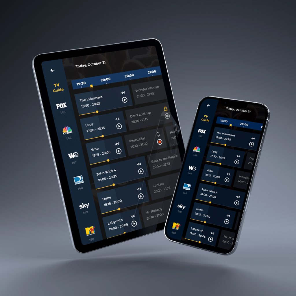
For this project, I designed a TV guide interface focused on helping users quickly navigate past, current, and upcoming programs across multiple channels. The goal was to create a clear visual structure that allows users to instantly understand what is currently airing, what has already passed, and what is coming next. Each program card displays key information such as the title, broadcast time, age rating, and a short description, along with visual indicators for available actions. Depending on the program’s status, users can immediately watch currently available content or set reminders and recordings for upcoming shows. Special attention was given to differences between TV and touch devices. The interface was designed to adapt to both environments.
Homesrus
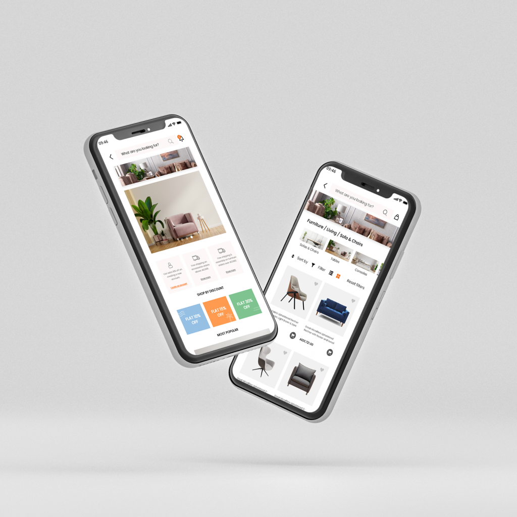
Homesrus was a project for a client that already had a website and already had most of the things predefined. The main purpose is to easily sell online products that are household items. You can see what is on sale, what is the most-shopped article, and what is new in the collection. It was also very important to enable easy shipping and return policy to the customers.
Coffee talks
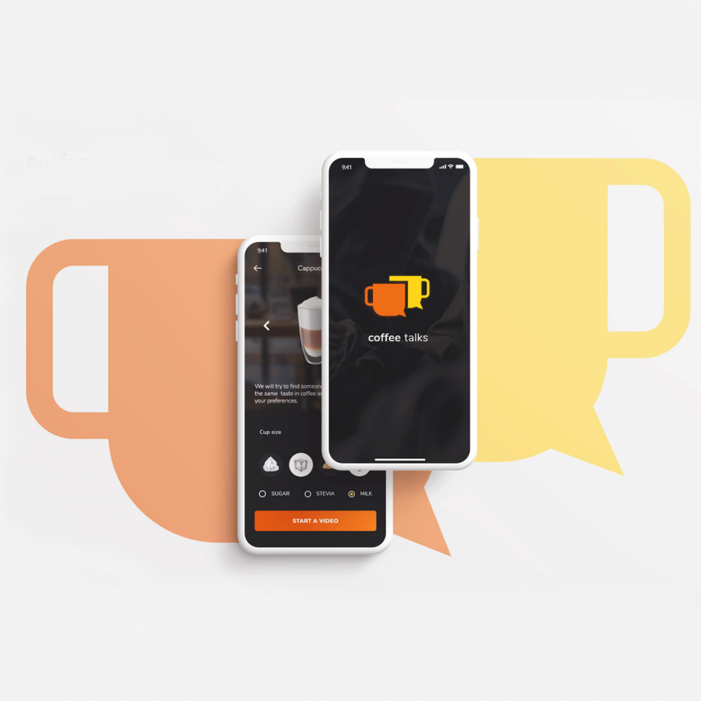
Coffee talks is dating app but with a focus on coffee lovers. The main functionality that is different from dating apps is that you only have limited time for each call. You have 5 minutes in total for a successful call with another user. That is only the rule for a starter talk. The reason behind this is a part of the shyness that some people have. The shorter and more focused talk you have the less is there uncomfortable silence. Another thing that prevents users from being uncomfortable is the option for a pick-up line or a conversation starter. This being said, you can choose a topic from the main tags and the other user will see your chosen topic.
Perfect PO
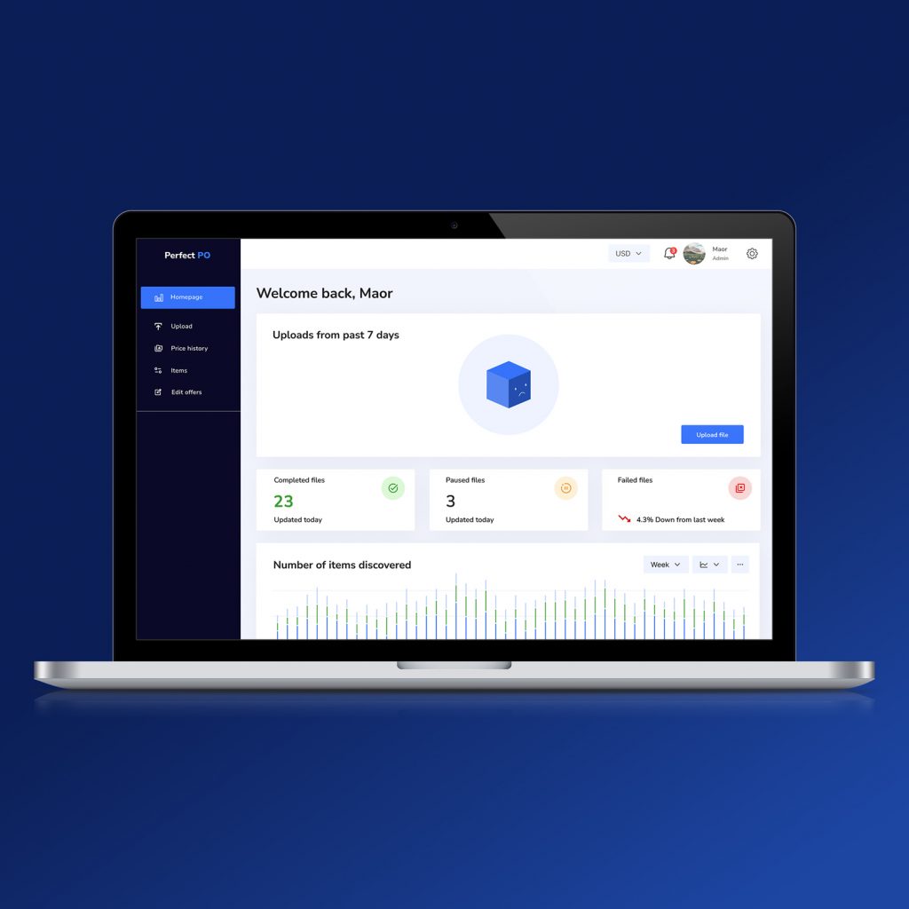
This project was created for a client working in the reselling industry who needed a specialized tool to simplify product research and bulk listing workflows. The goal was to design a dashboard that makes it easier to search items, analyze pricing data, and generate structured Excel files ready for export. The dashboard highlights key metrics such as processed files, failed uploads, and discovered items, helping users quickly understand their workflow status. Special attention was given to simplifying repetitive tasks like data upload, item discovery, and exporting information into spreadsheets.
Doc Redesign
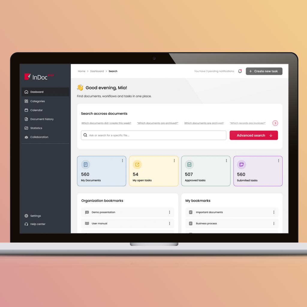
The existing platform had a very outdated interface and a cluttered structure that made navigation and data overview difficult. I created a redesign proposal focused on modernizing the dashboard and improving usability. The new design introduces clearer information hierarchy, simplified navigation, and a more structured layout for key metrics and actions. By reducing visual noise and reorganizing the interface, the dashboard becomes easier to scan, understand, and use in daily workflows.
The Product Design Process: From Idea to Interface
Every product starts with an idea. Sometimes it’s a clear concept. Sometimes it’s just a vague problem someone wants to solve. Clients or product teams often come with a vision of what they want to build, but the path from that initial idea to a usable product is rarely straightforward. This is where product design begins. As a designer, my role is not only to make something look good. It’s to understand the problem, structure the solution, and transform an abstract idea into something people can actually use. Here is how I typically approach the product design process. Understanding the Problem First Before opening any design tool, the most important step is understanding the problem behind the product. When someone comes with an idea, the first questions I usually ask are: Very often, the initial idea evolves during this stage. What seemed like a clear feature might actually be a deeper usability problem or a gap in the user experience. Taking time to clarify the problem helps avoid designing solutions that look good but don’t actually solve anything meaningful. Research and Context Once the problem is clear, the next step is understanding the environment in which the product will exist. This can include: Research doesn’t always need to be extremely formal. Even simple exploration of existing products can reveal useful insights about what works, what doesn’t, and where opportunities exist. This stage helps frame the design decisions that follow. Mapping the Product Structure After understanding the problem and context, I usually begin structuring the product. This often involves mapping things like: Tools like Miro or FigJam are especially useful during this stage because they allow ideas to be visualized and organized before moving into interface design. At this point, the product still exists mostly as a system of ideas, not yet as screens. Wireframing and Early Concepts Once the structure of the product becomes clearer, I start exploring possible interface solutions. This stage usually involves creating wireframes – simplified layouts that focus on structure rather than visual details. Wireframes help answer questions like: The goal here is not visual perfection. It’s about exploring different ways the interface could work. Designing the Interface After the structure and flows are validated, the design moves into the visual stage. This is where the interface begins to take its final form. Using tools like Figma, I start building the actual UI, focusing on: At this stage, design systems and reusable components become extremely important because they help maintain consistency across the product. Prototyping and Interaction Once the interface screens are designed, the next step is prototyping. Prototypes allow the product to behave more like a real application. Designers can simulate interactions, transitions, and navigation flows. This helps the team understand how the product actually feels to use before development begins. It also makes communication with developers and stakeholders much clearer. Iteration and Refinement No product is perfect on the first attempt. Design is an iterative process. Feedback from stakeholders, developers, and sometimes users helps identify areas that can be improved. During this stage, designs are refined, interactions are adjusted, and the overall experience becomes more polished. Iteration is where many good ideas become great ones. Turning Design Into a Real Product Finally, the design needs to be translated into something developers can build. Modern design tools like Figma make this collaboration easier by allowing developers to inspect design files, access design tokens, and export assets directly. At this stage, the role of the designer often shifts toward supporting development and ensuring the final product stays true to the design intentions. The product design process is not a straight line. It moves between exploration, structure, visual design, and iteration. What starts as a simple idea slowly becomes a structured product experience. For me, the most interesting part of product design is exactly this transformation, taking a vague concept and shaping it into something clear, useful, and meaningful for the people who will use it.
What Every Product Designer Should Know in Figma
Figma has become the central tool for modern product design teams. It’s not just a UI design tool anymore – it’s an entire environment for collaboration, prototyping, and building scalable design systems. Because of this, knowing how to draw screens in Figma is no longer enough. Product designers today are expected to understand how to structure files, build reusable systems, and collaborate effectively with developers and other designers. Here are some of the most important Figma skills every product designer should know. Auto Layout Auto Layout is one of the most essential features in Figma. It allows designers to create responsive layouts that adapt automatically when content changes. Instead of manually adjusting spacing and alignment, Auto Layout makes it possible to build flexible UI elements that behave more like real interface components. Understanding Auto Layout is crucial for designing scalable interfaces and maintaining consistency across screens. Components and Variants Components are the foundation of efficient design in Figma. They allow designers to reuse UI elements across multiple screens while maintaining consistency. Instead of recreating buttons, inputs, or navigation elements repeatedly, components make it possible to update them globally. Variants extend this idea by allowing designers to create different states of a component within a single structure, for example: This makes UI systems much easier to manage and scale. Design Systems and Component Libraries As products grow, maintaining visual consistency becomes more complex. This is where design systems become essential. In Figma, designers can create shared libraries that include: These libraries can be shared across teams and projects, ensuring that everyone works within the same visual framework. Prototyping and Interaction Design Figma also allows designers to build interactive prototypes directly inside the design environment. Designers can simulate: Prototyping helps communicate how a product behaves before development begins and allows teams to test ideas early. Developer Handoff One of the reasons Figma became so widely adopted is its developer-friendly workflow. Developers can inspect design files directly to access: This reduces the need for separate documentation tools and helps designers and developers stay aligned. File Organization and Structure Good Figma work is not only about visual design, it is also about structure. A well-organized file should include: Clean file organization makes collaboration easier and prevents confusion when multiple designers work in the same project. Collaboration in Real Time One of Figma’s most powerful features is real-time collaboration. Multiple designers can work inside the same file simultaneously, leave comments, review designs, and iterate together. Product managers, developers, and stakeholders can also participate directly in the design process. This collaborative environment has significantly changed how design teams work. Figma is much more than a tool for drawing interfaces. Learning how to use Figma efficiently means understanding not only the interface, but also how to structure design systems, create reusable components, and support collaboration across the product team. Mastering these skills allows designers to move faster, maintain consistency, and focus more on solving real user problems.