
Job seeking app
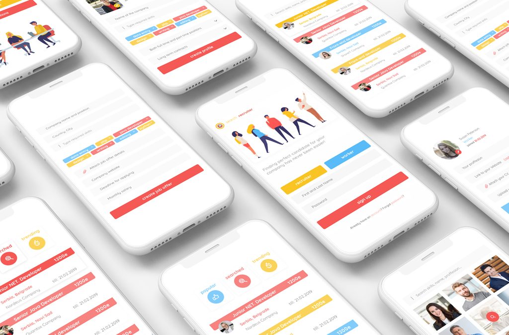
This early concept explored a mobile app for job searching and hiring, focused on simplifying how candidates and recruiters connect. The interface was designed to make browsing roles, filtering listings, and creating profiles quick and intuitive, with a clear visual hierarchy and lightweight onboarding flow.
Argus blog
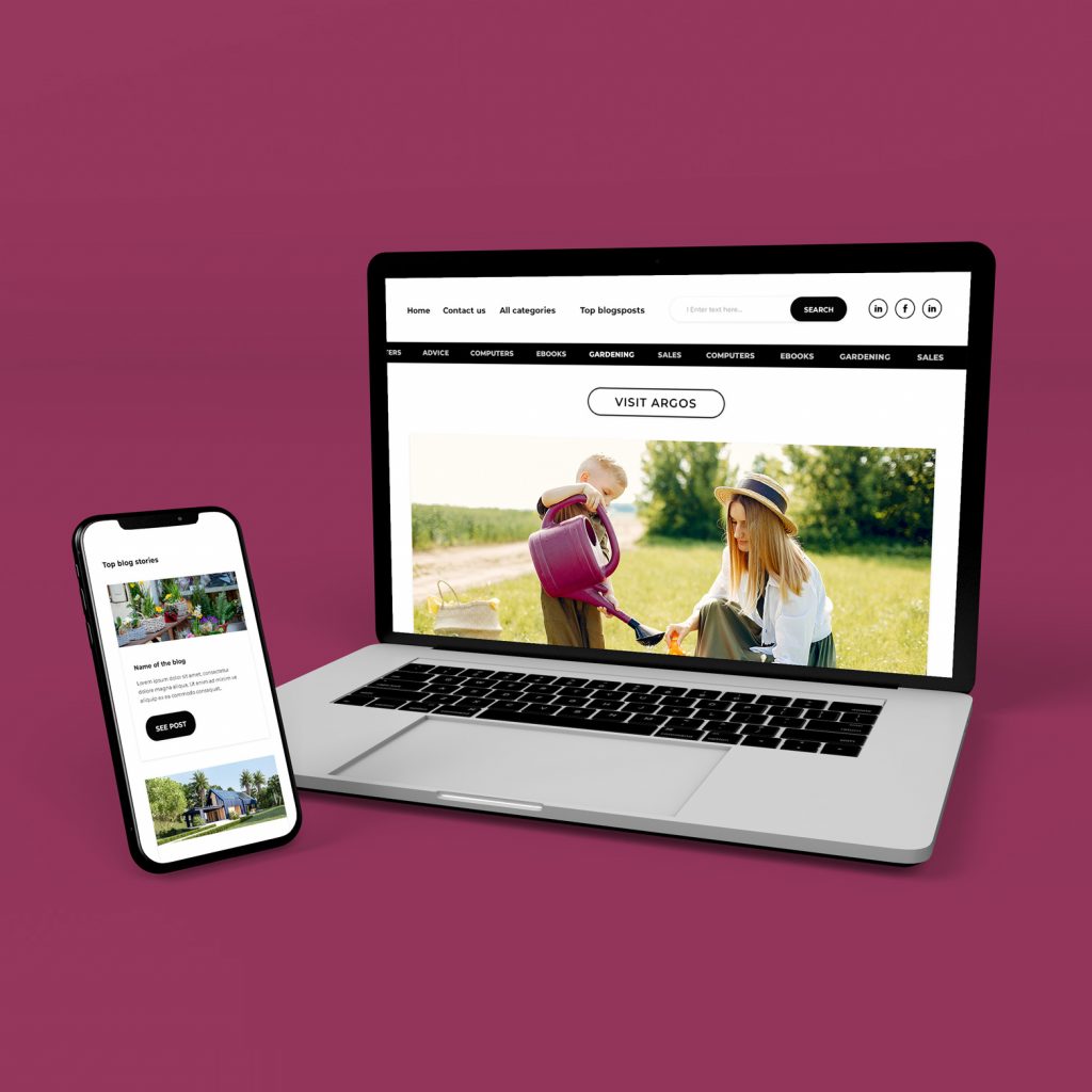
This blog layout was designed with a strong focus on content density and advertising space. The structure allows for clear separation between editorial content and promotional blocks, making it easy to integrate banners, sponsored sections, and sidebar ads without disrupting readability. The goal was to keep the interface simple and modular so new posts, featured stories, and ad placements could be updated quickly. I worked on the overall layout system, balancing article readability with multiple ad zones, while ensuring the design remains clean, responsive, and easy to navigate across devices.
Aerofit
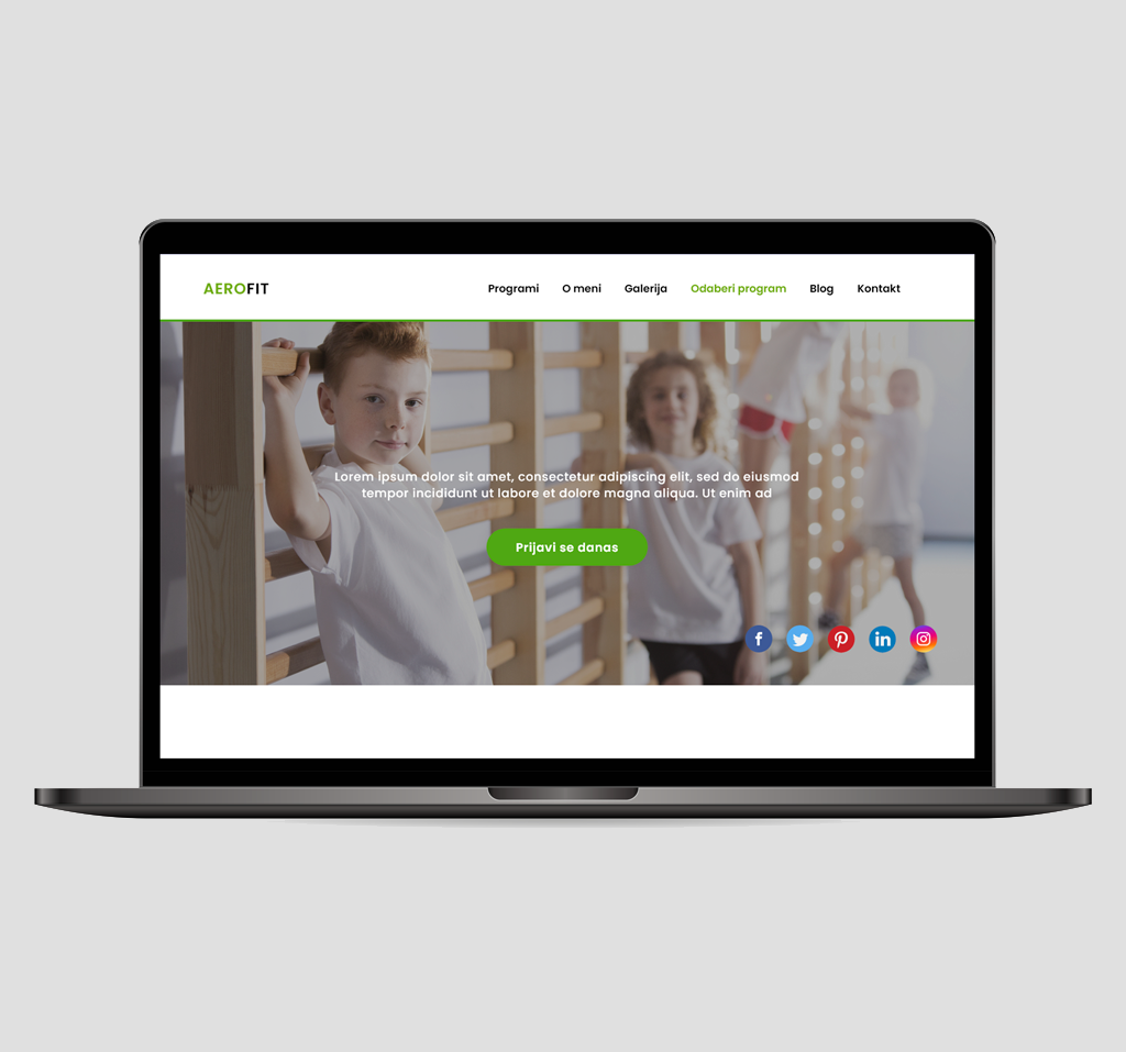
Aerofit was a website created for fitness instructor Jovana Stančić. Her main focus is corrective gymnastic for kids in order to prevent problems in future. But she also work with older population. This landing was created for upcoming platform that she will have. Platform will serve as a online coaching with easy steps and easy daily practices that anyone can follow. Since her main audience are kids, website needed to be interesting in colors, warm and bright. Since mostly parents will apply here in the name of their kids website also needed to be simple to use and with clear information about workout routine. On the main page there is also explanatory video, and also there is blog for news and latest discounts.
Travel landing
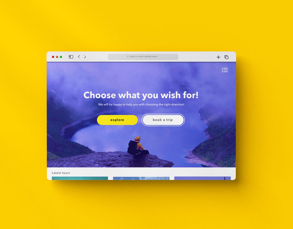
This travel website template was one of my earlier design projects, created as a flexible landing concept for tour and destination-based businesses. The template combines immersive photography with a clean, modular layout, allowing travel brands to easily adapt destinations, pricing, and content while maintaining a consistent and engaging presentation.
Template design
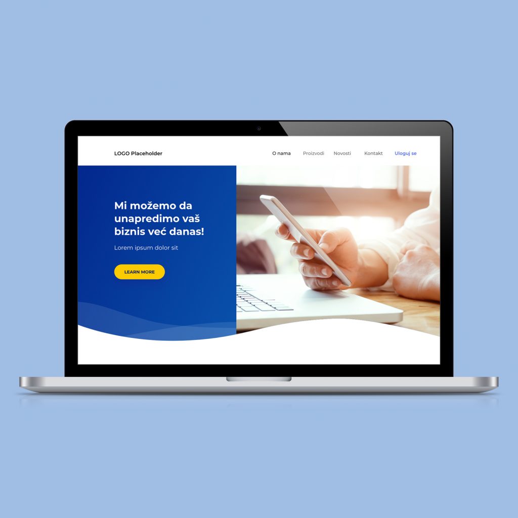
This project was created as a modular website template intended for clients who would later build and adjust their own layouts. The goal was to provide a clear structure and reusable sections that could be rearranged depending on their needs, without requiring full custom design each time. Because the website builder this template was made for had very limited customization options, the design had to work within a fixed system of predefined blocks and layouts. That meant focusing on clarity, strong visual hierarchy, and flexible sections that could function well even with minimal editing capabilities. The template includes core components such as hero, product listings, news, and contact sections, all designed to be easily combined in different ways. The visual style is neutral and adaptable so different brands can apply their own colors, images, and content while keeping the structure consistent and easy to manage.
Cellrebel
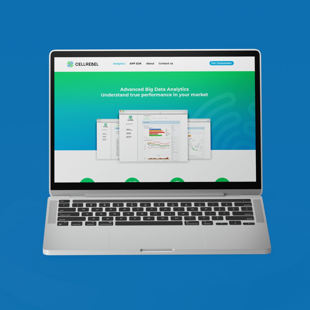
This landing page was designed to present a B2B analytics dashboard and clearly communicate what business clients gain from the platform. The goal was to showcase key modules network performance, customer experience, and subscriber behavior in a structured and visually digestible way. Instead of overloading the page with data, I focused on framing each feature around its business value and practical insights. The layout guides potential enterprise clients through product capabilities, SDK functionality, and technical depth, while maintaining a clean and professional SaaS aesthetic.
Book design
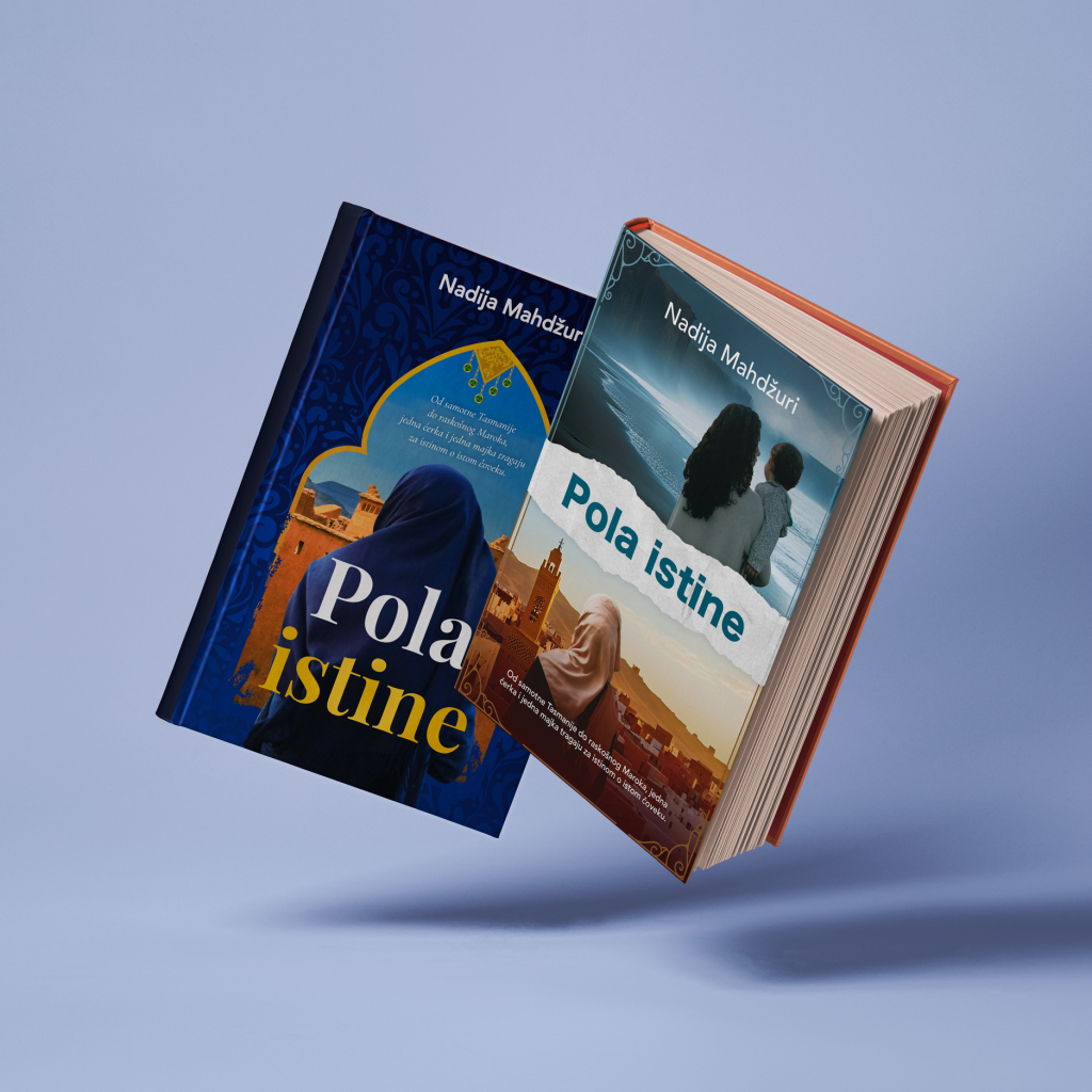
A book cover design showcasing two editions of the novel “Pola istine” by Nadija Mahdžuri, exploring identity, memory, and emotional journeys through warm visual storytelling, cultural motifs, and atmospheric landscapes.
Landing page Quantox
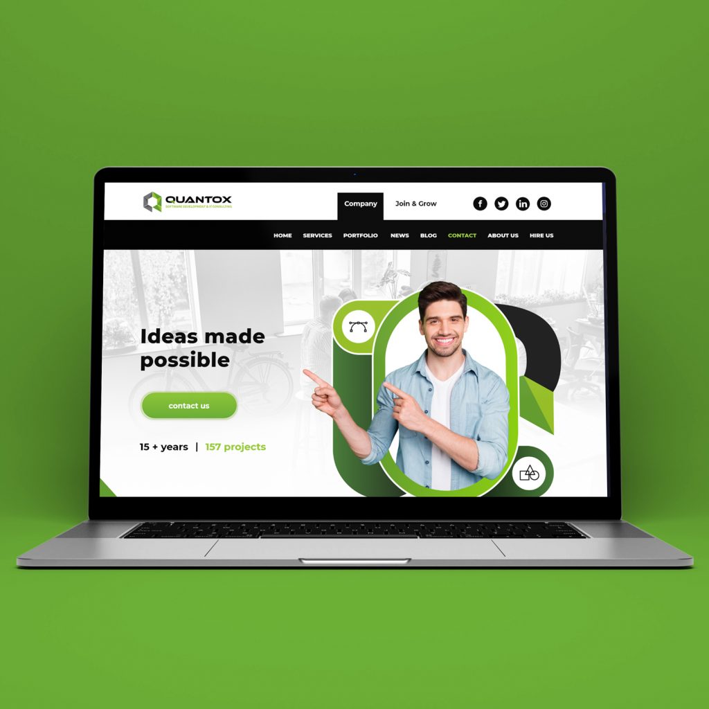
This website concept was created for a software development company focused on delivering structured, scalable digital solutions. The layout emphasizes clarity, credibility, and service presentation, balancing strong visual hierarchy with clean content blocks. I designed both desktop and mobile versions, ensuring consistency across breakpoints while keeping the user journey straightforward from service overview to portfolio exploration and contact. The visual direction is minimal and corporate, using accent color strategically to highlight calls to action and key metrics, while maintaining a professional and trustworthy feel throughout.
Moja strana
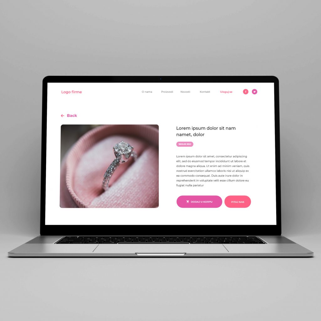
This project focuses on a clean e-commerce layout designed for a small product-based brand. The structure is straightforward and product-led, allowing visuals to carry most of the communication while keeping navigation simple and familiar. I worked on the landing, product listing, and single product views, keeping the interface light and easy to scan. Soft color accents and minimal UI elements help maintain a calm shopping experience while keeping attention on the items themselves.
Compressa
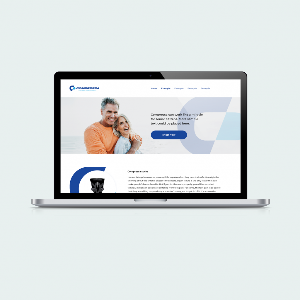
The focus of this project was to design a clear and trustworthy landing page for a medical-adjacent product aimed at comfort and everyday use. The visual direction is intentionally restrained, with a clean layout and structured content that supports readability and product credibility. I worked with a calm color palette and strong geometric shapes to create visual consistency across sections while keeping attention on the product itself. The page is organized to present key information gradually, combining product highlights, supportive imagery, and short explanatory blocks that make the content easy to follow.