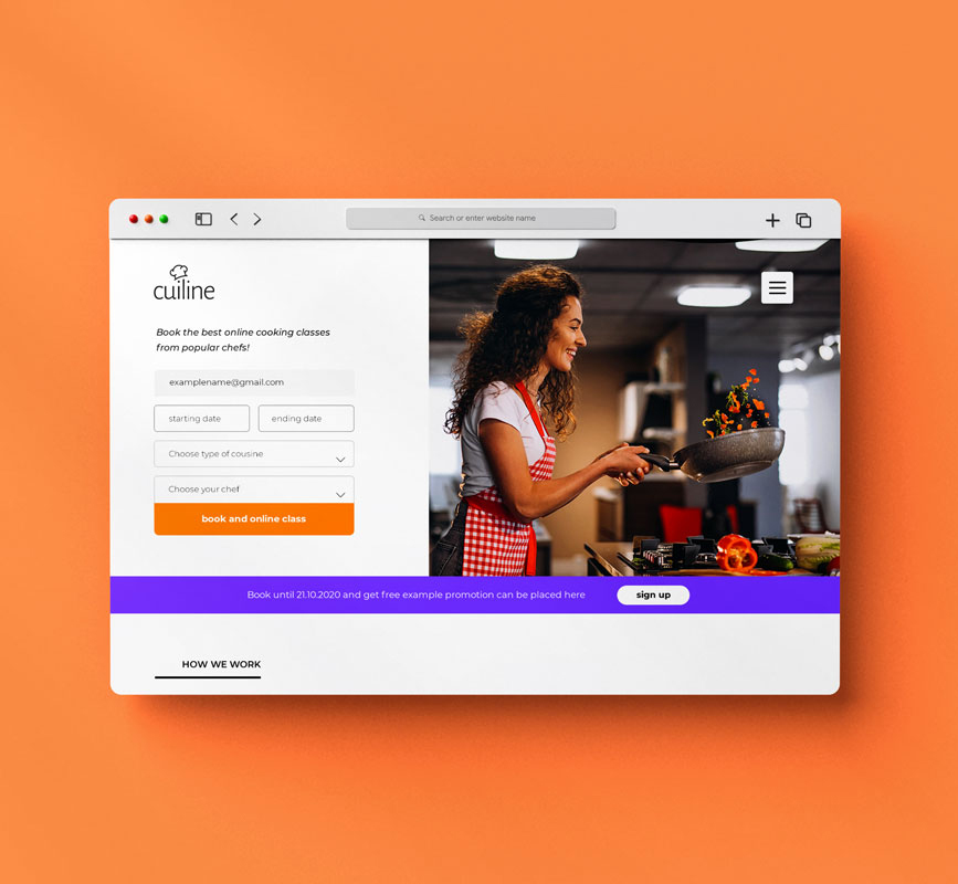
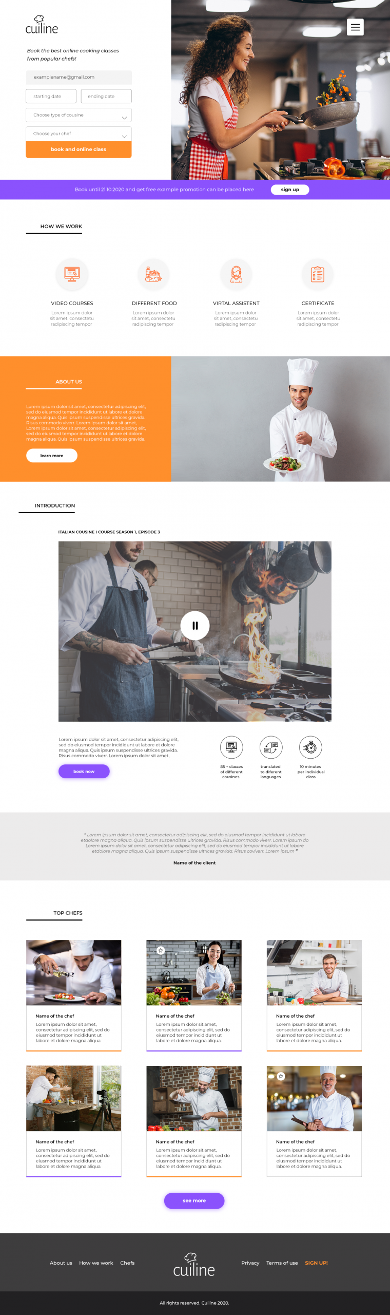
This project grew around the idea of making cooking feel social and accessible, not complicated. The interface is centered on the moment of choosing a class and jumping straight into the experience, with large visuals and clear booking actions leading the flow.
I kept the layout structured but warm, letting food photography and chef profiles carry most of the atmosphere. Bright accents and soft gradients add energy without taking over the content. The goal was to make everything feel friendly and easy to browse, like scrolling through a cooking platform that actually makes you want to join a class.
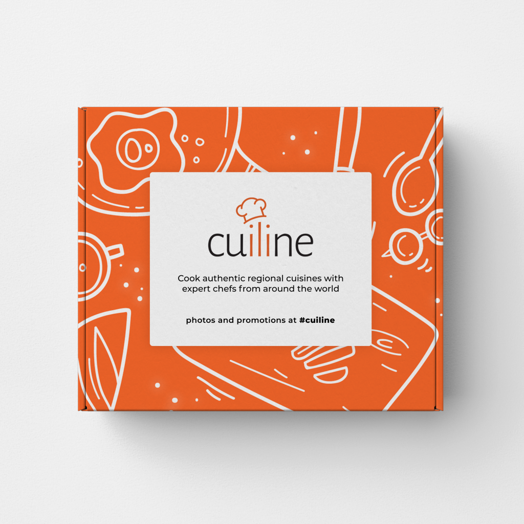
Alongside the website, I also explored the visual direction through packaging and brand elements, keeping the same playful, food-focused identity across different touchpoints.