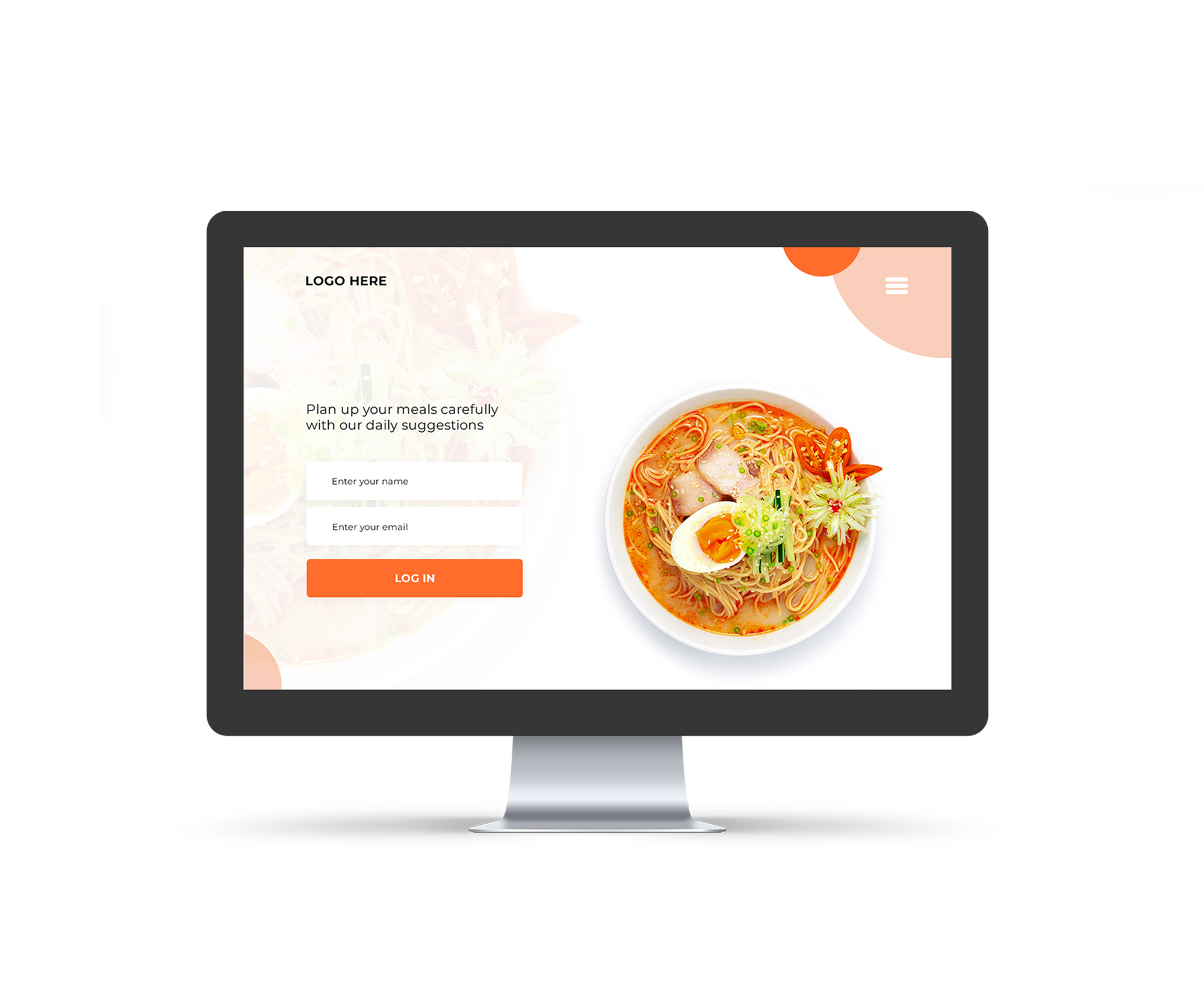
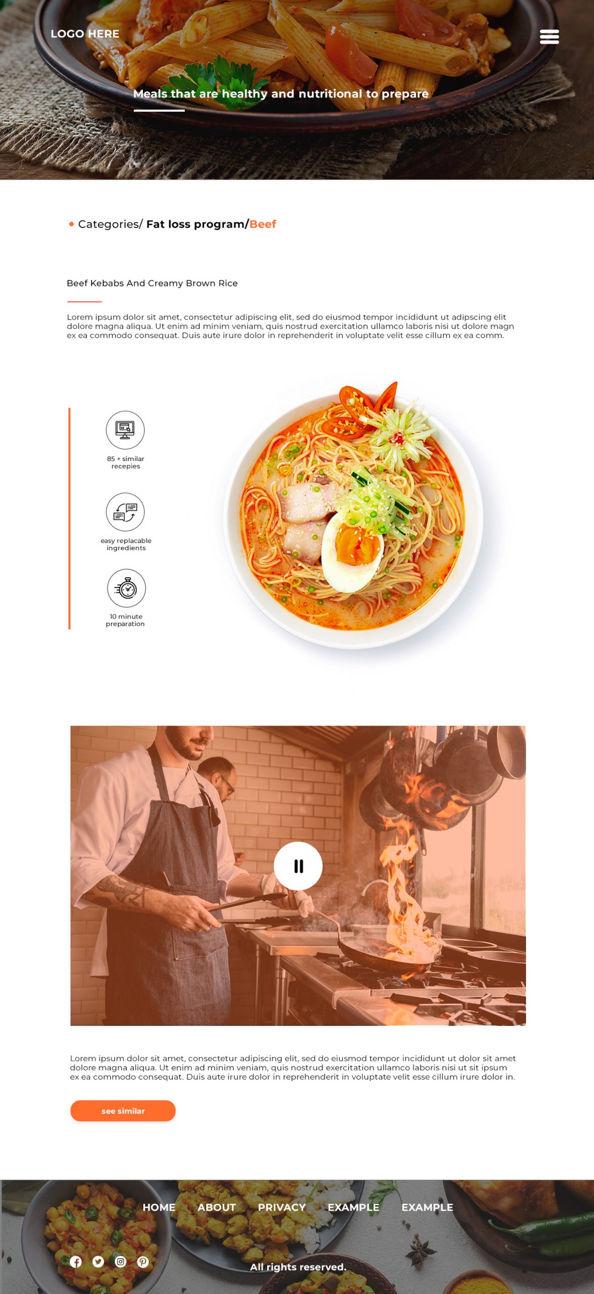
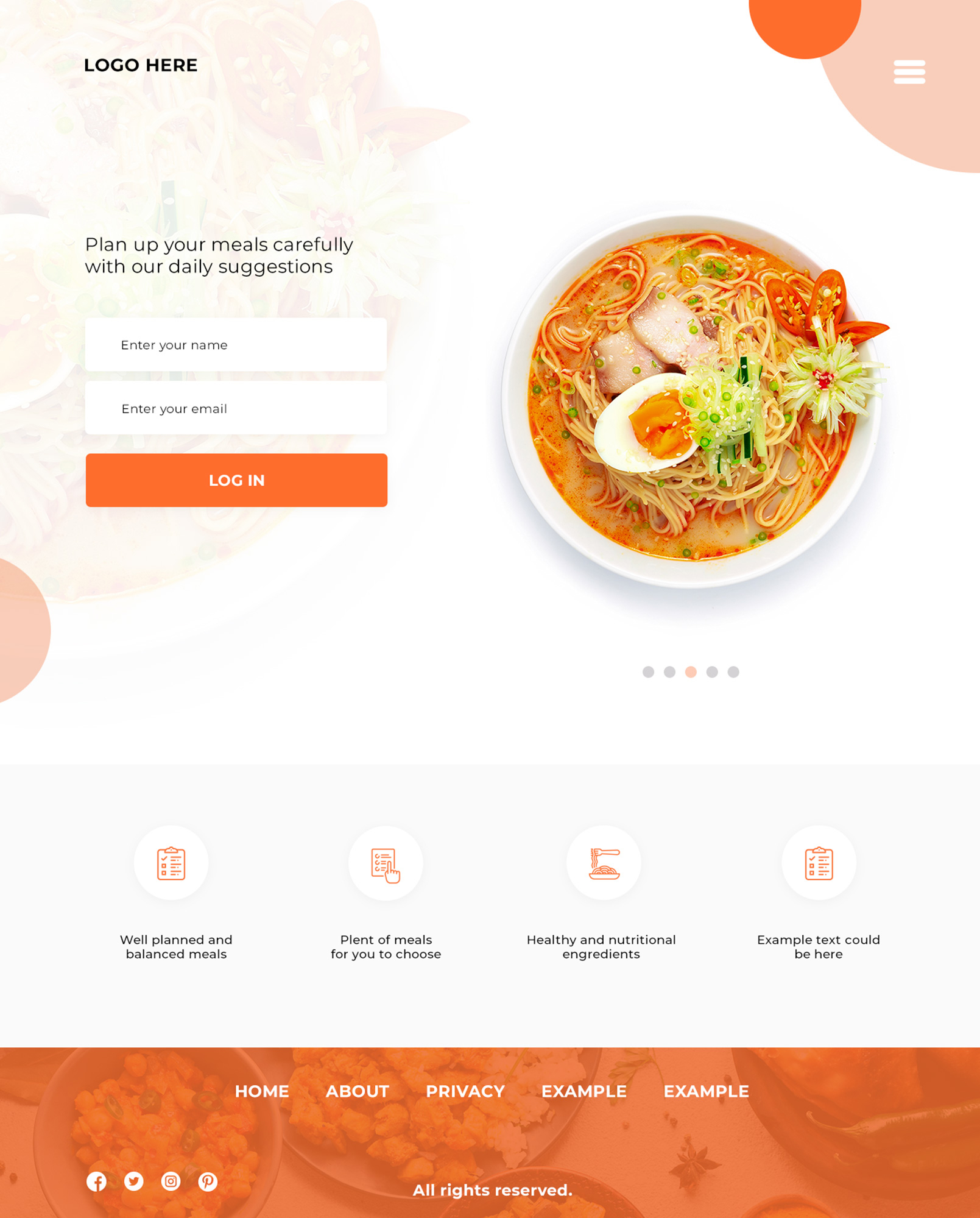
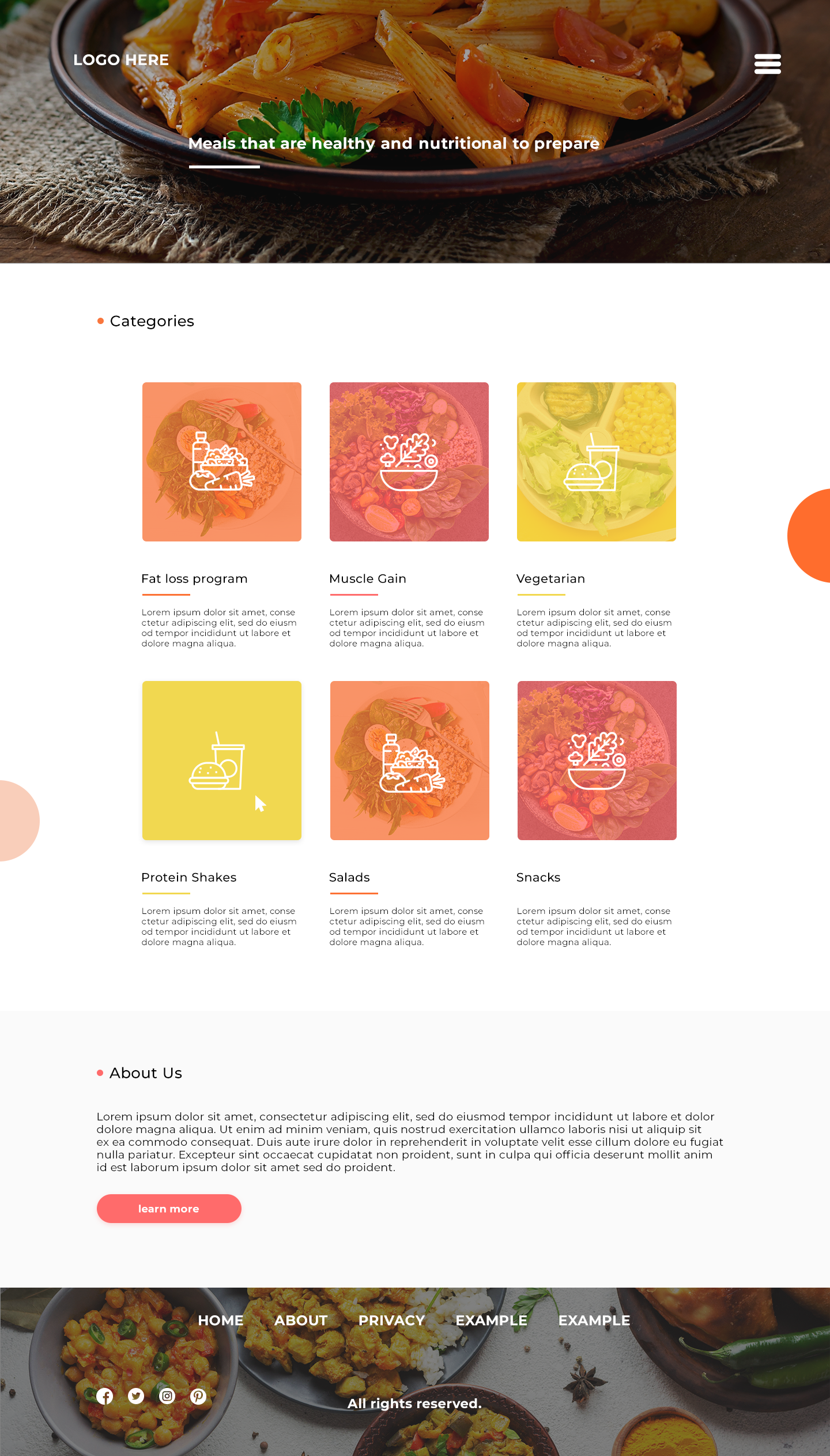
Diet was the main focus here. I wanted the visuals to feel fresh, clean, and appetizing without making the layout heavy. Large imagery leads the experience, while the structure stays simple and organized so the focus remains on the meals and categories.
The interface is built around easy exploration. Users can quickly browse meal types, move through programs, and read about each recipe without distraction. Soft neutral backgrounds combined with warm accent colors help balance clarity and warmth.