
Meta website
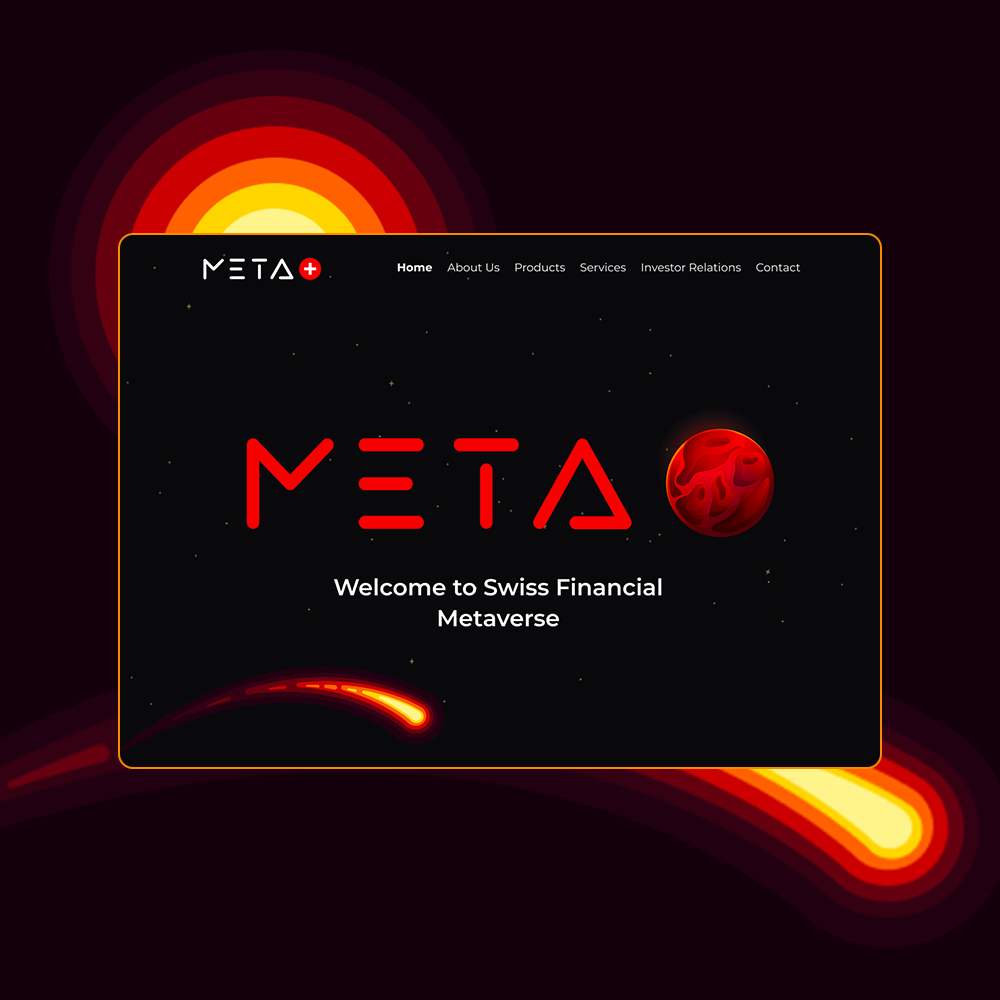
I created the entire design system and led the redesign of the platform, including the development of a new landing page, improving the overall user experience. Each part of the site was crafted separately — one section for clients, another for products, and another for companies. This approach allowed me to give each area its own distinct visual identity while ensuring that all sections remained visually complementary to the overall design and brand.
Meta app
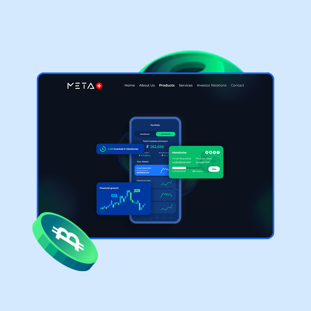
I designed the landing page specifically for MetaSwiss Group core product: their mobile application. The goal was to present the app as a modern and innovative tool that allows users to easily invest in and manage digital assets, such as MetaBonds, MetaShares, and MetaNFTs. The visual approach revolves around the app’s intuitive interface, showcasing screens that highlight key functionalities like real-time asset management, portfolio overview, and transaction history. The landing page emphasizes seamless mobile access, portraying the app as a powerful yet user-friendly solution for digital asset management.
Metaverse
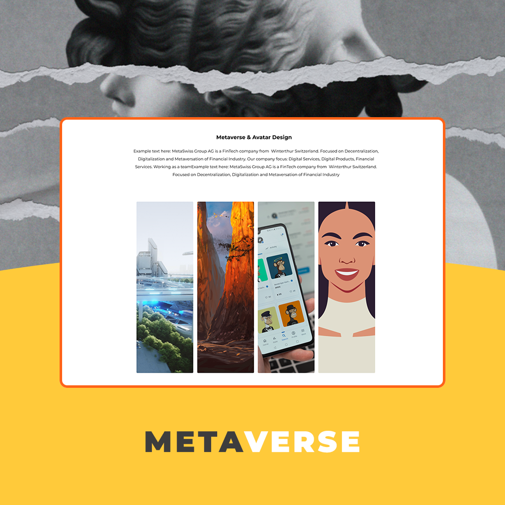
While working for Meta Swiss company I designed a dedicated section of the platform that showcases MetaSwiss Group AG as a service provider, focusing on their expertise in digital services, software development, and financial innovation. The goal was to create a user-friendly and visually appealing interface that clearly communicates the range of services offered, including metaverse development, NFTs, digital solutions, and avatar design. This section was crafted to ensure potential clients could easily navigate and understand the various services available.
Obviously
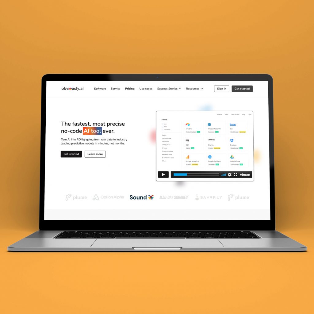
I designed the desktop landing page and mobile version for a no-code AI platform. The focus was on presenting a complex product in a clear and approachable way through strong visual hierarchy, clean layouts, and simple navigation. The page is structured to highlight the main value quickly, then guide users through features, use cases, and social proof in easy-to-scan sections. On desktop, I worked with a balanced grid and modular components, while the mobile version adapts the layout for clarity and smooth scrolling without losing the core messaging.
3MP Monitoring
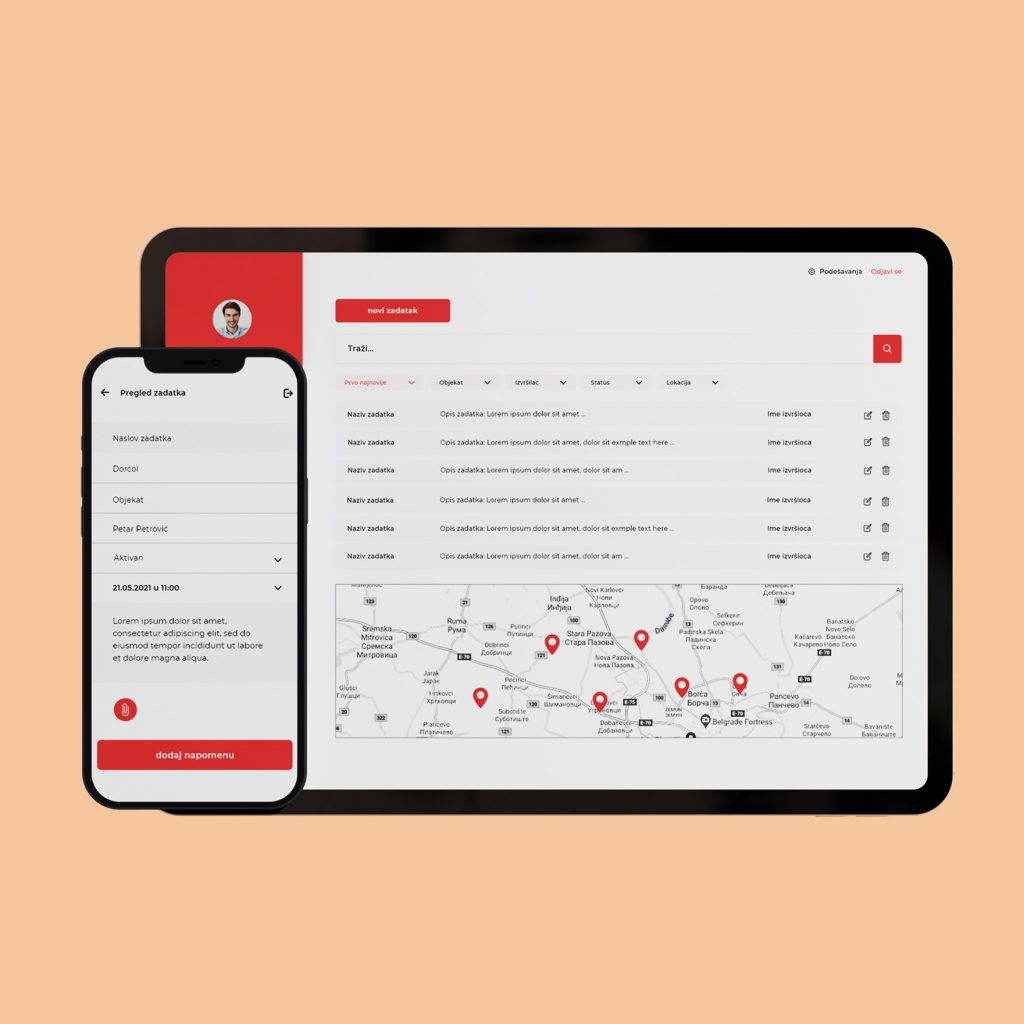
3MP Monitoring was a very complex project with a need for not just responsive, but adaptive design. It needed to be adjusted to each device, each screen with slightly different (native) elements yet similar functionality. The main purpose of 3MP is to monitor construction workers in their workplaces. Admins can see each individual worker in real-time, can see how many lunch breaks they have, and can track complete projects from scratch to finish. Workers mainly use mobile devices to start their working day, they have face identification as the first step. Then they can see what tasks they have, what kind of role is assigned to them, and similar details. Admins can see all of this content but with additional responsibility. They can delete users, they can give a new role to a worker, and can also organize and create tasks for everyone. The obstacle was the fact that most workers are not that much in the IT field, so the app needed to be very clean and very simple in order for them to understand and use it properly on a daily basis.
Mobomo
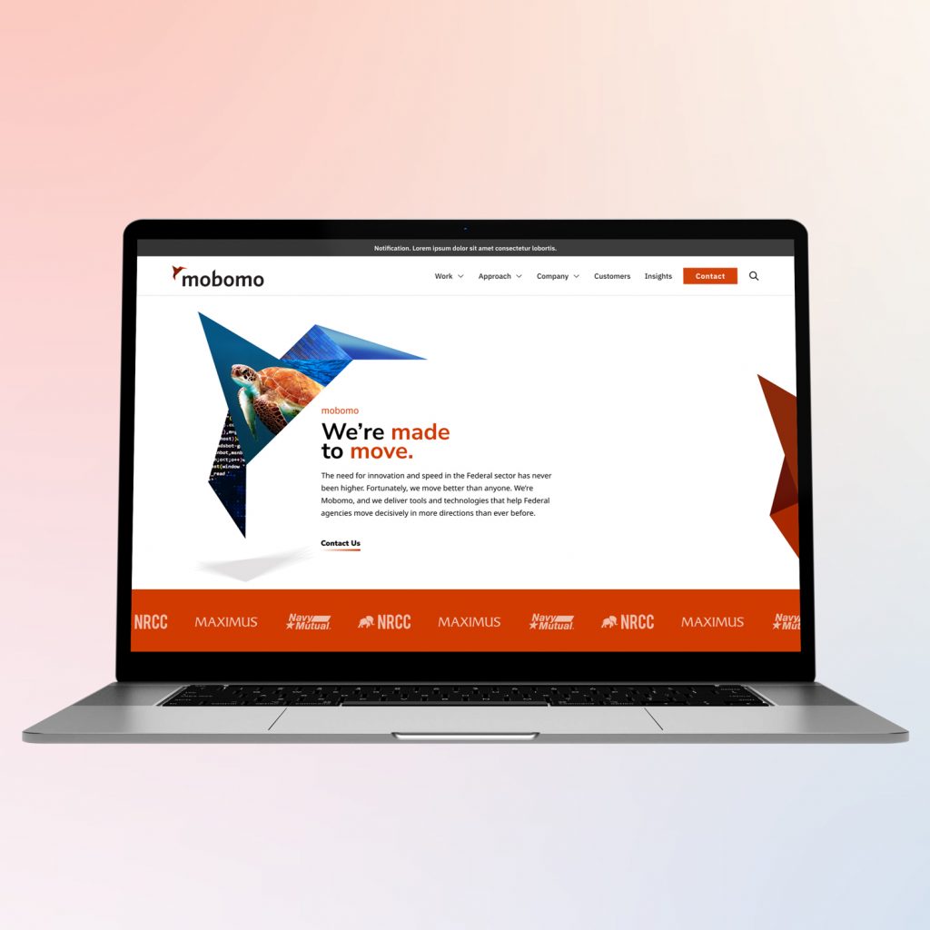
For this project, I explored a redesign concept for the Mobomo website with the goal of making the structure clearer and the content easier to navigate. The focus was on presenting complex services, case studies, and partnerships in a more structured and visually engaging way. I rethought the page hierarchy and reorganized key sections such as services, federal projects, insights, and partnerships to create a smoother flow through the site. The redesign also introduced a stronger visual system, using bold geometric elements and clear content blocks to highlight important information and improve readability. The result is a more modern and structured layout that better communicates the company’s expertise, large-scale projects, and impact in the federal and technology sectors.
Healthcare website
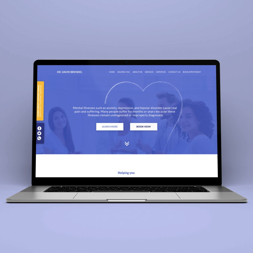
Designed a responsive website for a mental health professional focused on clarity, trust, and accessibility. The goal was to present complex services in a calm, structured way while encouraging users to book consultations easily. I created a clean information hierarchy with a strong hero section, service categories, and clear call-to-action paths for booking appointments. The design balances professionalism and warmth through soft colors, supportive imagery, and readable typography to reduce friction for users seeking help. The project included homepage layout, service sections, booking flow, and mobile responsiveness, ensuring the experience works seamlessly across devices and communicates credibility and empathy.
Trivo
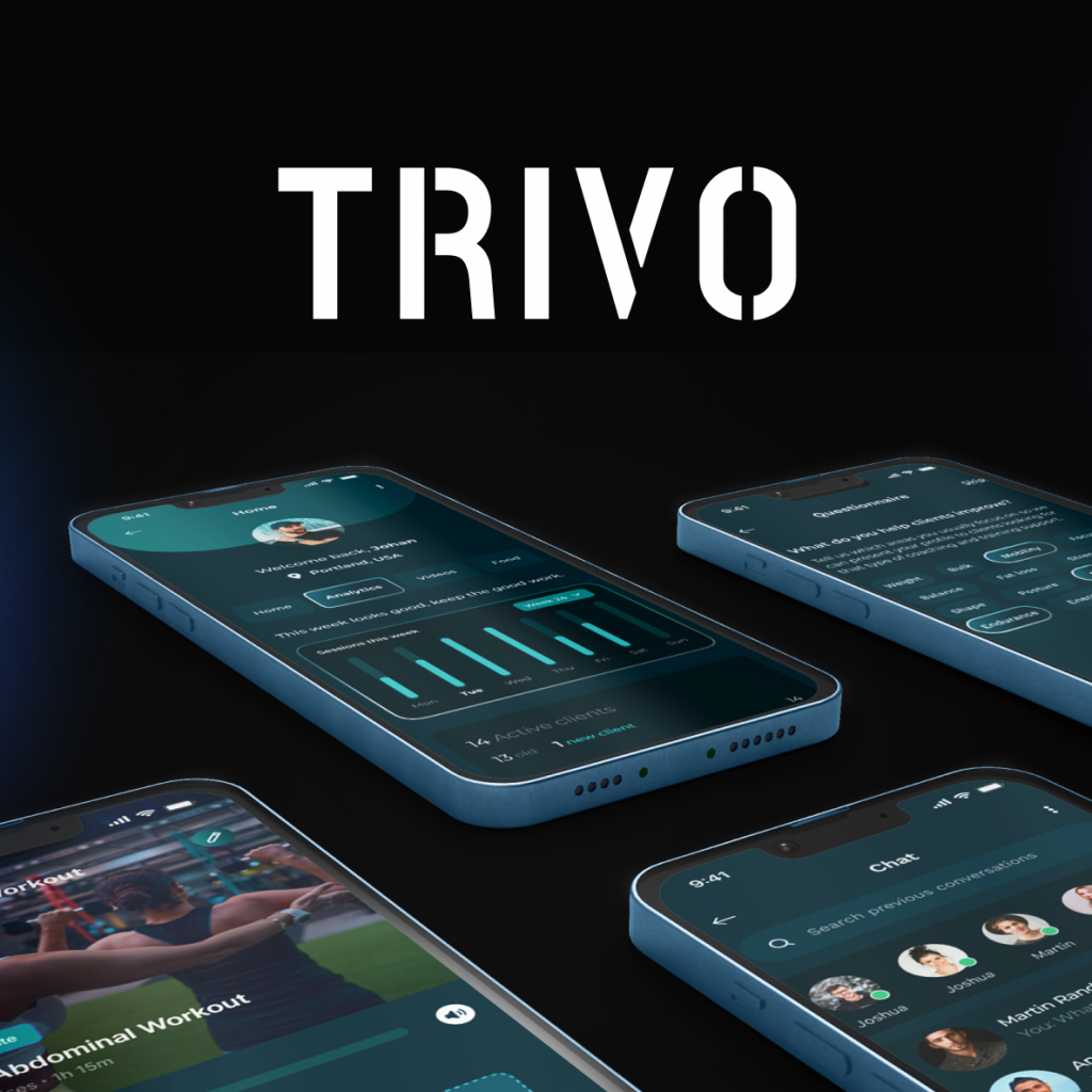
TRIVO is a mobile platform designed to connect athletes with professional coaches while simplifying the way training programs, communication, and progress tracking are managed. The goal of the platform is to create a more structured and personalized fitness experience for clients, while also providing coaches with tools to organize their work and manage multiple clients efficiently. The product is built around two core user roles: clients and coaches. Clients can explore training programs, track their progress, communicate with coaches, and follow personalized workouts and nutrition guidance. Coaches, on the other hand, can manage their clients, upload training videos, create structured programs, schedule sessions, and monitor activity through analytics dashboards. Navigation structure built to support client management, training program creation, and session coordination. Client experience focuses on discovering coaches, following training programs, and tracking personal progress. Thank you for watching.
Valent
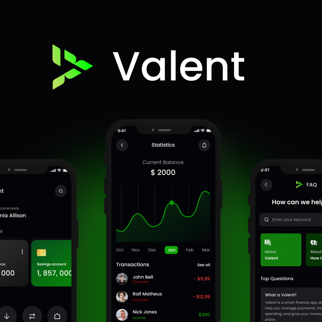
Valent addresses the complexity of modern financial management by combining payments, spending insights, and budgeting into one intuitive platform. The goal is simple: help users make better financial decisions with less effort. Thank you for watching.
Solace AI
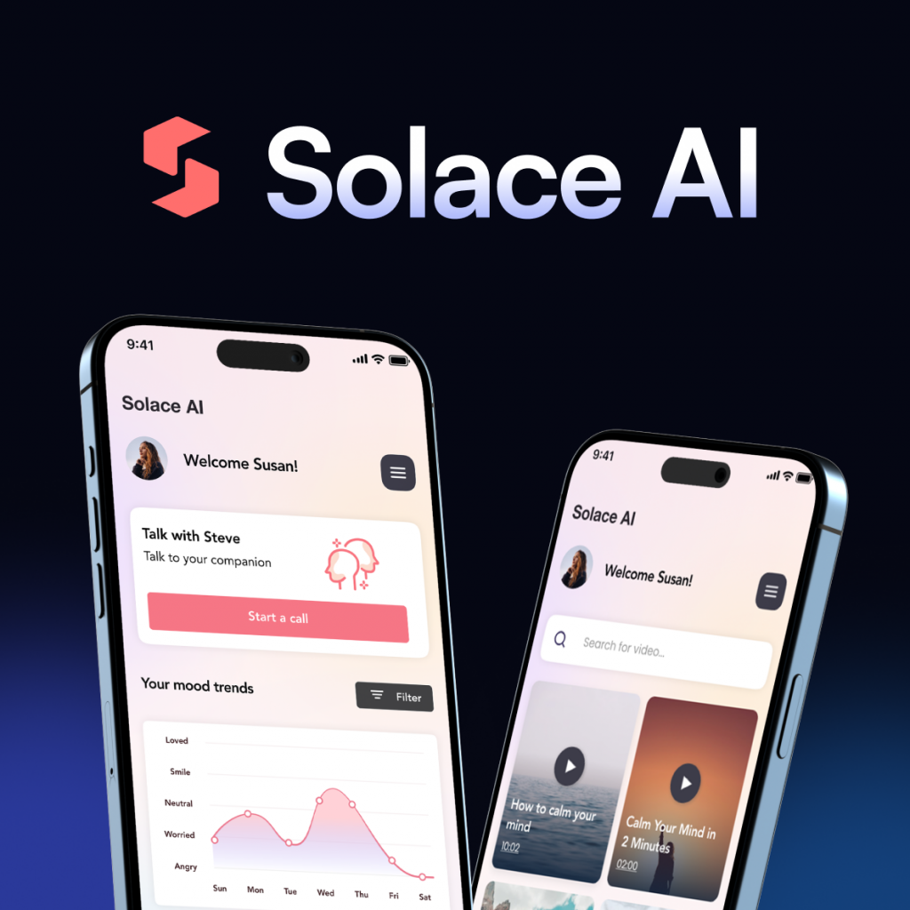
To better understand how users interact with Solace AI, I mapped the overall application flow and the key paths users can take throughout the experience. The goal was to design a simple and supportive structure where users can quickly access tools that help them reflect, relax, and process their emotions. After onboarding and a short personalization process, users enter the main dashboard, which acts as the central hub of the application. From there, they can start a conversation with the AI companion, write a journal entry, explore calming exercises, or access curated content designed to support mental wellbeing. This flow highlights how different features connect within the app and how users can move between reflection, guidance, and relaxation depending on their current emotional needs. To better understand how users interact with Solace AI, I mapped the overall application flow and the key paths users can take throughout the experience. The goal was to design a simple and supportive structure where users can quickly access tools that help them reflect, relax, and process their emotions. “Sometimes I just need a quiet space to clear my head and understand what I’m feeling.” The navigation was designed to be simple and intuitive, allowing users to easily move between the main parts of the application. From the home screen, users can quickly access the video library, the AI companion, and their personal account settings. The AI tool represents the core feature of the product, so it is accessible through multiple paths. Users can start interacting with the AI directly from the home screen or navigate to the dedicated AI tab, providing two clear routes to reach the main functionality of the app. Before moving into visual design, I created a large set of low-fidelity wireframes to map the overall structure of the product. Based on the identified user needs and frustrations, I mapped the main pain points and translated them into practical design solutions. The goal was to ensure that each key challenge users face is directly addressed through a specific feature within the app. By connecting user problems with clear product solutions, the design focuses on providing emotional support, simplifying reflection, and offering accessible tools such as AI conversations, guided journaling, relaxation exercises, and mood insights. Important info: Designing Solace AI was an engaging exploration of how AI-driven tools can support people in everyday moments of stress, reflection, and emotional awareness. The project highlights how thoughtfully designed digital experiences can provide accessible mental wellness support through conversation, journaling, and calming exercises. At the same time, it is important to recognize that tools like this should be approached responsibly. AI can offer helpful guidance and space for reflection, but it is not intended to replace professional medical or psychological care. Instead, it can act as a complementary support tool that helps users better understand their thoughts and emotions. Thank you for watching.